Project Insights
Challenges
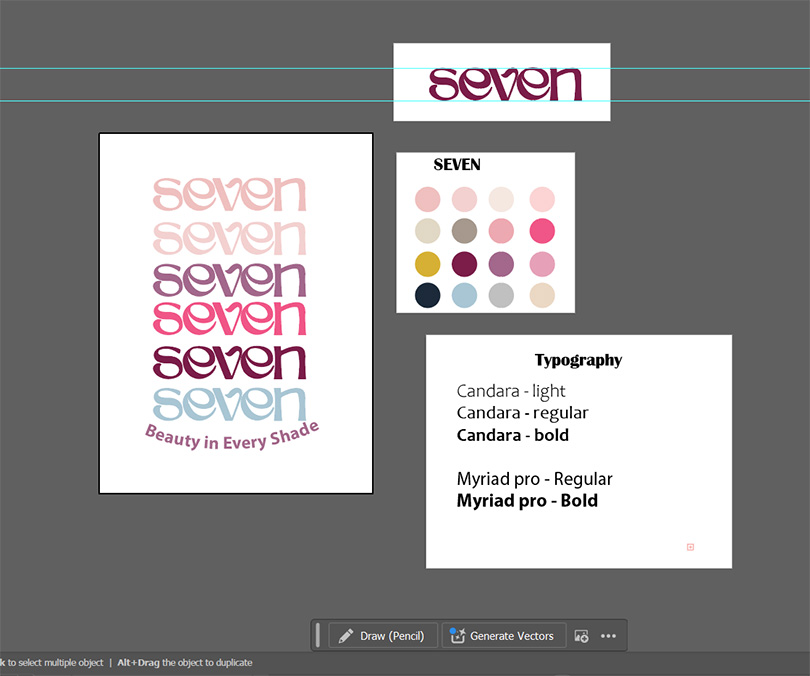
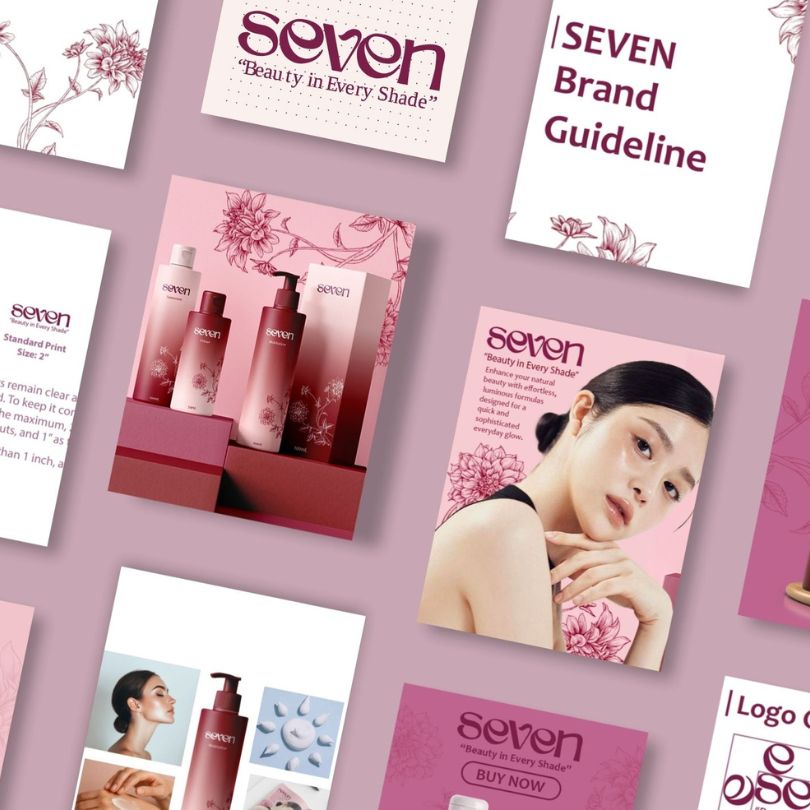
Creating the logo was one of the main obstacles we faced, as we wanted a logo that feels unique yet appealing for target age group. Once we finalized the logo, the next challenge was to pick a colour palette that matches the overall brand's visual. Since the logo didn't use any font style, we had to choose a simple and easy-to-read font for the slogan and other packaging text.
Solutions
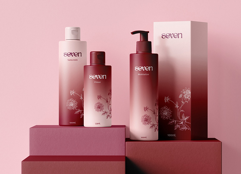
We chose to go with illustrating the brand logo using the Pen Tool in Adobe Illustrator to give a custom look. For the slogan, we chose simple font called Myriad Pro that compliments the logo. We selected Burgundy as a primary color for our brand which gives bold and elegant with Muted Purple as a secondary color as a body color in brand doc and other packaging to make it easy to read.